Assess your image
Our brand: Scouting provides skills for life and life changing adventure
Our identity is important. It affects how people think and feel about our Movement and is largely formed by what we do – provide skills for life to young people. But our communications are important too. They need to express our scouting values: integrity, respect, care, belief and cooperation.
To help us achieve this we have a corporate identity that reinforces our presence as a strong youth charity committed to enriching the lives of young people and supporting our adult volunteers.
Our corporate identity, made up of our logo, words, images, colours and font elements helps people to recognise and understand scouting.
How we sum up scouting?
Each week, we give over 460,000 young people the opportunity to enjoy fun and adventure while developing the skills they need to succeed, now and in the future. We’re talking about teamwork, leadership and resilience – skills that have helped Scouts become everything from nurses and government officers to astronauts and Olympians.
We believe in bringing people together. We celebrate diversity and stand against intolerance, always.
We’re a worldwide movement, creating stronger communities and inspiring positive futures.
Scouts include presidents and prime ministers, explorers and entrepreneurs. They have climbed Everest, stood at the South Pole and walked on the moon. Scouts are also teachers and social workers – the people who make society work. They are all united by common values and their promise to help other people.
What is a brand?
A brand is simply what appears in someone’s head when you mention a company or organisation. This could be a logo, a set of colours but more often associations and values that are attached to the organisation. When you think of Volvo cars for example, you might picture the company’s logo. More likely however, you will think about their reputation for safety. Preserving and maintaining this is very important to them – it determines whether someone buys their product or services or not and this goes for all companies you can think of. Our brand is: our personality, who we are and what makes us unique
What is Scouting’s brand?
Our brand is made up of two key elements: Skillls for Life, which is our key benefit, and Belonging, which is what we feel.
Skills for Life – What we say: We believe young people deserve the character, employability and practical skills to succeed.
Belonging – What we convey: We believe in bringing people together to enjoy fun, friendship and adventure in a place they can belong.
This is a long way from the stereotype of hats, tents, shorts, boys and woggles. Of course, we still have lots of boys in scouting and we still go camping, but scouting is about so much more than that. You know this – but how do we get the message across to everyone else?
The best way is for us all to follow a single positive definition of scouting, communicate it clearly, and with one voice. So, our brand is based around the idea of ‘Skills for life’ for everyone and at every level.
Why do we need a brand?
- To give people a clear idea about modern scouting – that it is relevant, valuable and enjoyable
- To help Scouting stand out from the crowd
- To increase the respect for, and value of Scouting locally and nationally
- To help with the recruitment of new adults and young people – people will only support something they understand.
Our tone of voice
The way we talk is just as important as what we say, whether in person, in print or online. It conveys our personality as a movement and helps us speak in a single, powerful and distinctive voice. It helps us cut through the noise and stand out from the crowd.
Our voice is:
We call this optimism with attitude.
When talking to the public, a more challenging tone, provoking an emotional response will help our voice be heard and ensure our benefits are understood.
When speaking to members of the movement, we can be less challenging (and more supportive) but still active, inclusive and confident.
The national style guide provides more guidance on how to translate our tone of voice into print and digital experiences you can find it at scoutsbrand.org.uk
Examples of our tone of voice:
Confident As Scouts, we believe in empowering young people with skills for life.
Active Volunteer and help young people gain skills to succeed.
Challenging We stand against intolerance, always.
Inclusive If you have any questions, please phone us
Optimistic We create stronger communities and inspire positive futures
Our logos
Our logo is very important to us. It’s the symbol that represents and unites us as a movement. Please use it consistently, to build awareness, recognition and adoption of our brand.
Section logos
Our section logos are very important to us. They represent and unite each age range. Please use them consistently to build awareness, recognition and adoption of our brands.
Our photography
Inspiring photography is at the heart of our brand. Our photography should show fun, friendship and adventure but above all, convey belonging. The emphasis should be on capturing moments of connection, learning, sharing, achievement and friendship. They should focus on the emotional response to activities rather than simply showing the activities themselves.
Photographs should:
-
Focus on young people who are active, engaged and absorbed in what they are doing
-
Be spontaneous and not posed; try to avoid ‘football team’ type shots or images of handshaking - it is much better to show an activity
-
Project our brand – ‘Skills for life’ and ‘belonging’
-
Reflect our tone of voice
Our colours
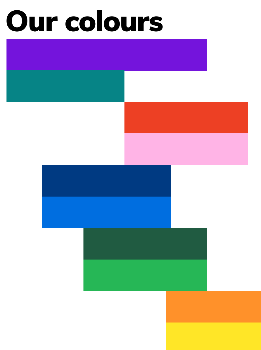
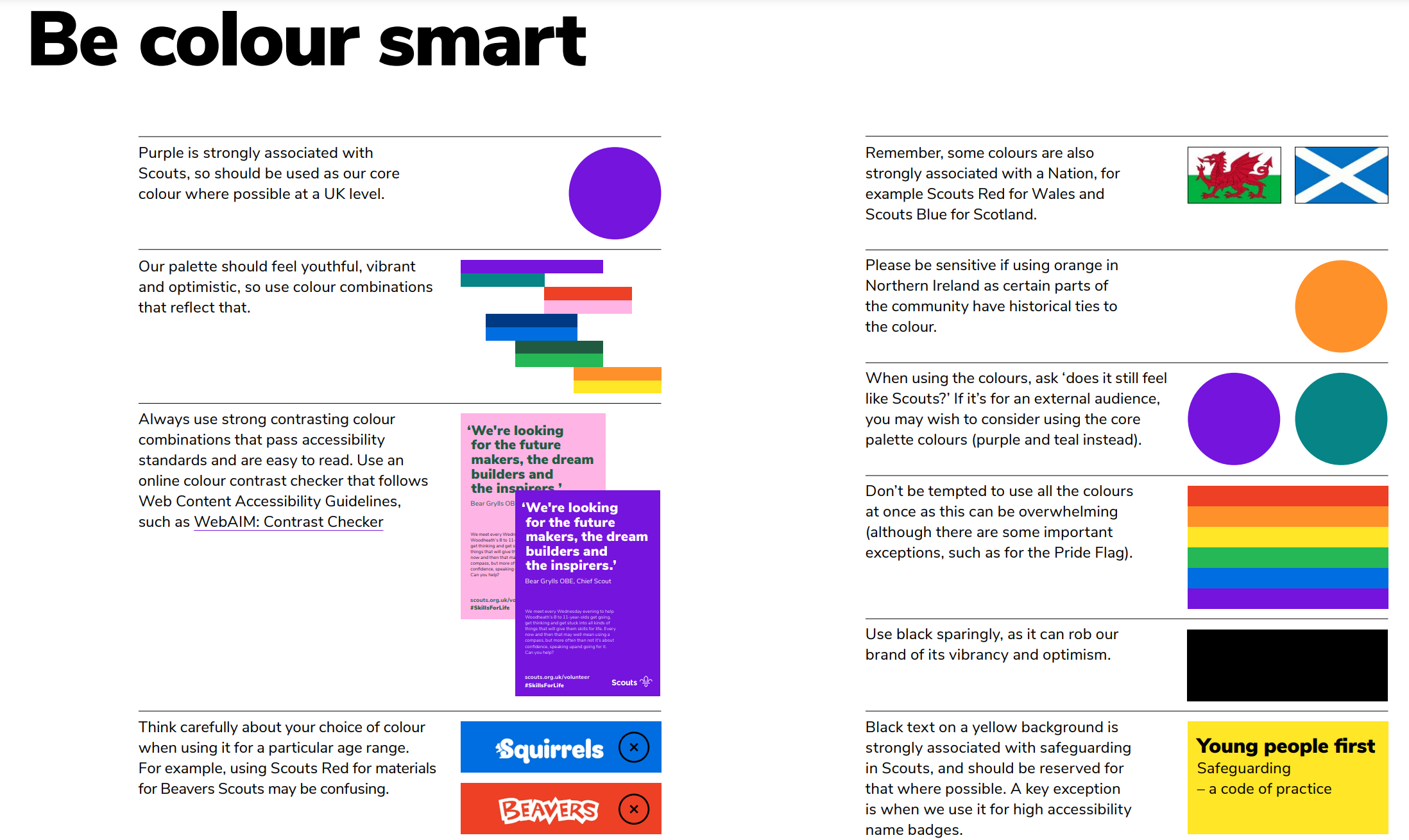
We use nine colours, plus black and white. The section brands are made up from these colours.
For design, the colours are best used alone or in the combinations shown over the next three pages. They are vibrant, engaging and help bring our brand to life.
When using colour with an image, choose a colour from the palette that complements the image. Limit the number of colours used and always use the correct colour breakdowns: CMYK and Pantone® for print and RGB for on-screen use.
Our typography
Our Scout brand font is Nunito Sans. This is a free Google font. It offers flexibility while being clean, contemporary and highly legible. It also expresses our personality and is confident and inclusive.
The font can be downloaded HERE
Support material
Brand centre
We want to make creating on-brand scout materials as easy as possible. Our brand centre www.scoutsbrand.org.uk contains a wide range of templates, tools and resources to support communications and recruitment, including:
- brand guidelines
-
logo artwork
-
local logo generator
-
web to print templates (including banners, posters, flyers, certificates, stationery)
-
social media templates
-
MS Office templates
-
photo library
-
videos
Click here to download the scout brand guidelines
Click here to download the Beavers, Cubs, Scouts, Explorers and Network sections brand guidelines
Click here to download the Squirrels Section brand guidelines


